Help Center / Products you embed
Match Slate to your brand colours
Set the colours your customers see in Slate screens so they match your product. Change a colour, watch the preview update, then publish.
6 min read · Updated November 10, 2026
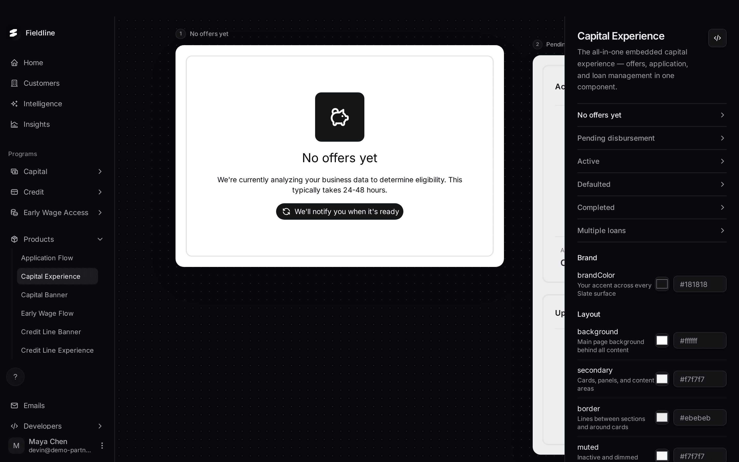
Slate's screens can use your colours, so they look like part of your product. You change a colour on a product page, the preview updates at once, and nothing reaches your customers until you publish.
You'll find the colour settings at the bottom of the right-hand column on each page under Products.
Where do I change colours?
- Application Flow has your logo, display name and Brand color. See Application Flow.
- Early Wage Flow has brandColor.
- Capital Experience and Credit Line Experience have brandColor and the full palette of 11 colours.
- Capital Banner and Credit Line Banner have brandColor and four banner colours.
All of these share one saved set. A colour you publish on the Capital Banner page also shows on the Capital Experience page.
What does each colour control?
Start with brandColor. It is your accent. It sets the buttons and accents customers see when they apply, and the main colour in the emails and contract documents Slate sends for you. It does not restyle the banners or the capital dashboard. Those use the palette below.
The full palette is on Capital Experience and Credit Line Experience. The banners show only four of them.
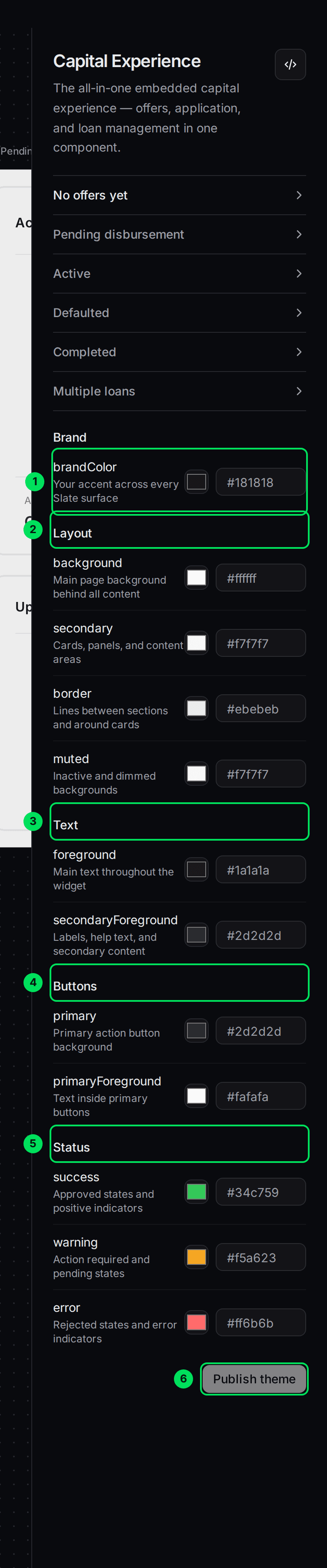
- brandColor: your accent across every Slate screen. Default
#181818. - Layout: the surfaces.
- Text: the writing.
- Buttons: the main button.
- Status: the colours for good, waiting and bad news.
- Publish theme: saves your colours.
Layout
- background: the main background behind all content. Default
#ffffff. - secondary: cards, panels and content areas. Default
#f7f7f7. On the banners, this is the background of the button. - border: the lines between sections and around cards. Default
#ebebeb. - muted: inactive and dimmed backgrounds. Default
#f7f7f7.
Text
- foreground: the main text. Default
#1a1a1a. - secondaryForeground: labels, help text and secondary writing. Default
#2d2d2d. On the banners, this is the text on the button.
Buttons
- primary: the background of the main action button. Default
#2d2d2d. On the banners, this is the whole banner background. - primaryForeground: the text inside the main button. Default
#fafafa. On the banners, this is the text on the banner.
Status
- success: approved states and good news. Default
#34c759. - warning: "action required" and waiting states. Default
#f5a623. - error: rejected states and errors. Default
#ff6b6b.
Change a colour and see the preview update
You can try any colour safely. The preview changes at once, and nothing is saved until you publish.
Open a product page
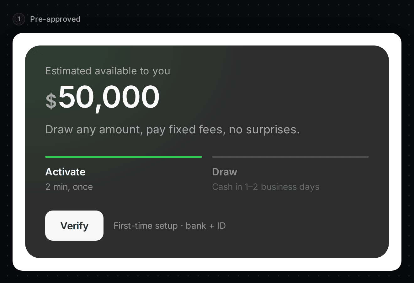
Select Products, then Capital Banner. Select a state, for example Pre-approved, so you can see the banner.
Type a new colour
Find primary in the Banner group. Select the box with the colour code and type a new six-digit code, for example #0b3d91. You can also select the colour square and pick one.
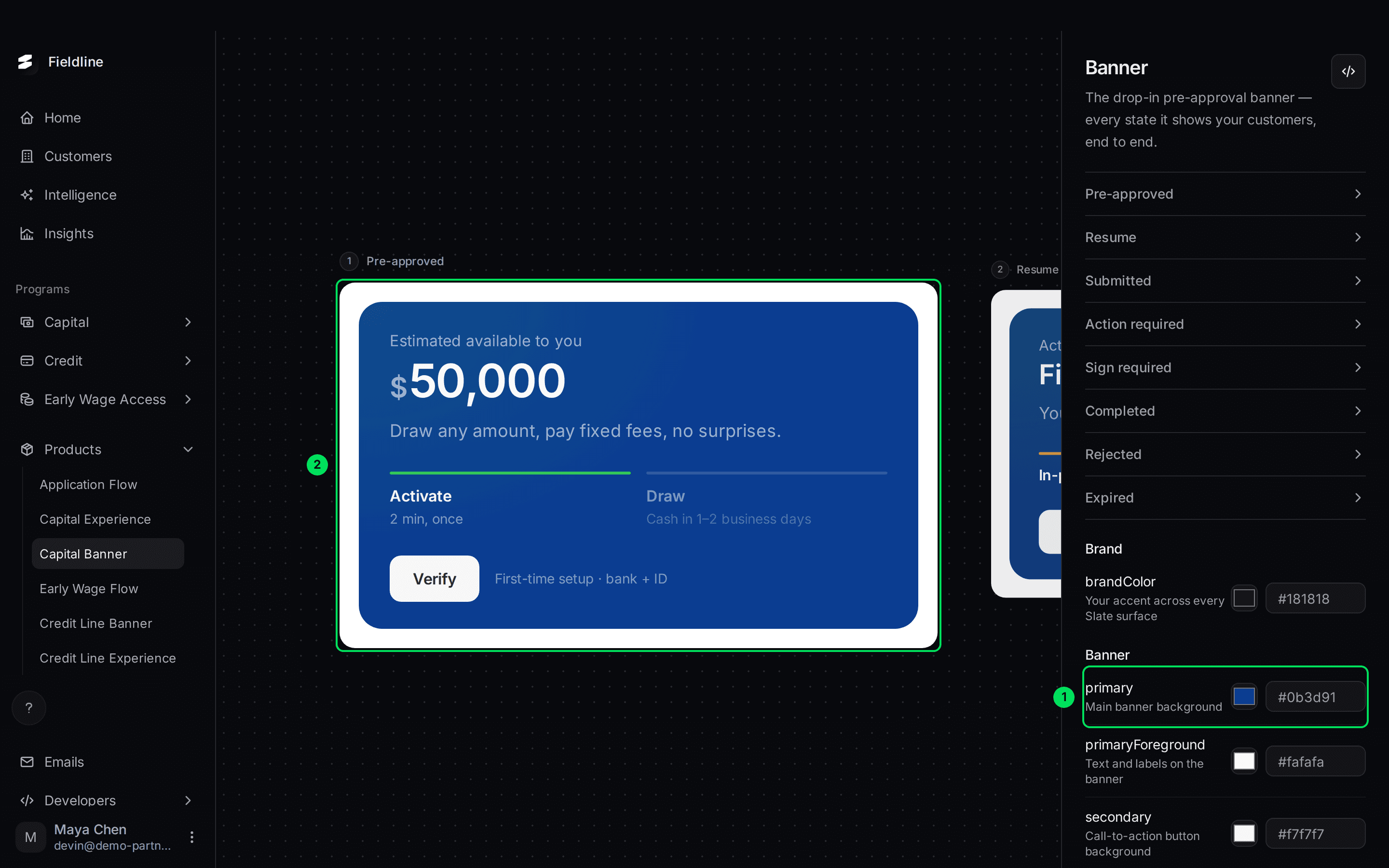
- primary: the field you changed.
- The banner preview, now blue.
- Publish theme: now ready to select.
Change the others to match
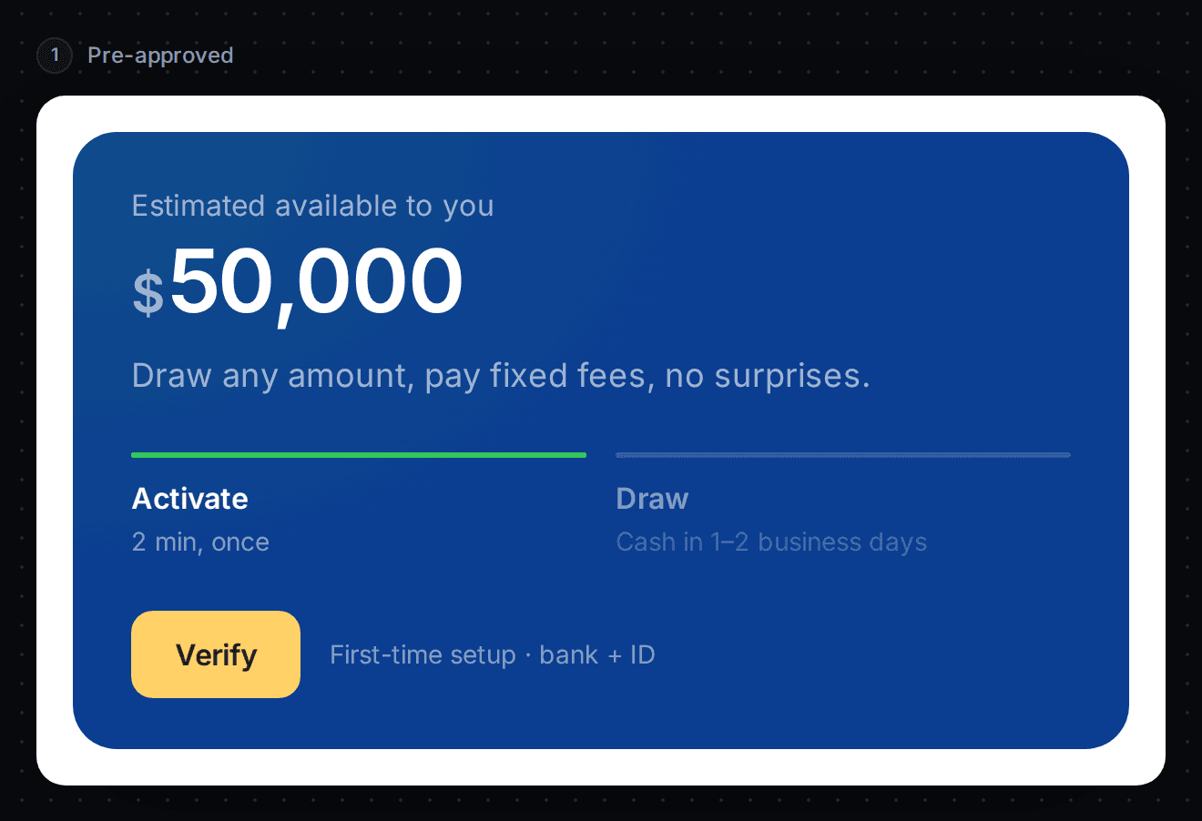
Change primaryForeground, secondary and secondaryForeground the same way. Here the button is yellow and its text is dark.
Use six digits
A colour code is a hash sign followed by six letters or digits, such as #0b3d91. If the code is not valid, the field gets a red outline. Fix it before you publish.
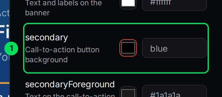
- secondary: the field with the red outline.
If you clear a field, Slate uses the default colour for it.
Publish your colours
Colours you type are a preview that only you see. Publish theme saves them for your customers.
Select Publish theme
Select Publish theme at the bottom of the colour settings. The button stays grey until you change something.
Check the confirmation
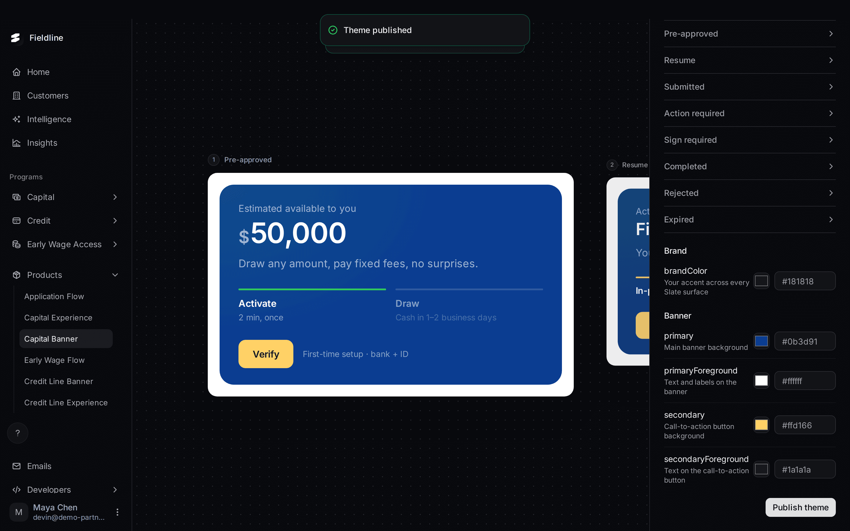
You see "Theme published" at the top of the page.
Check another page
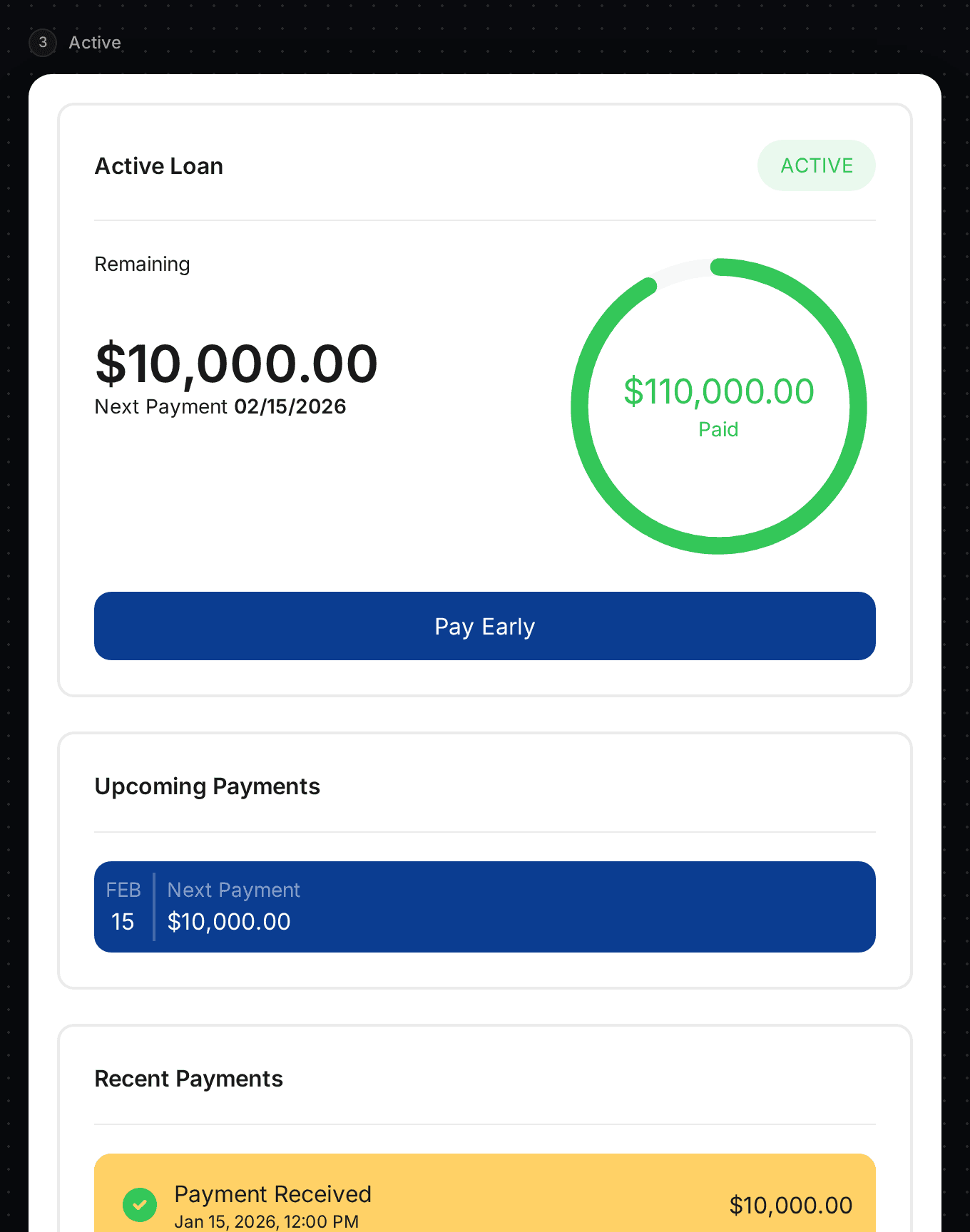
Open Capital Experience. The new colours are there too, because the set is shared.
Publish your application colour
The application has its own publish button. On Application Flow, type your colour in Brand color, then select Publish changes. It also saves your display name and logo. You see "Published" and "Customers see the updated application flow immediately."
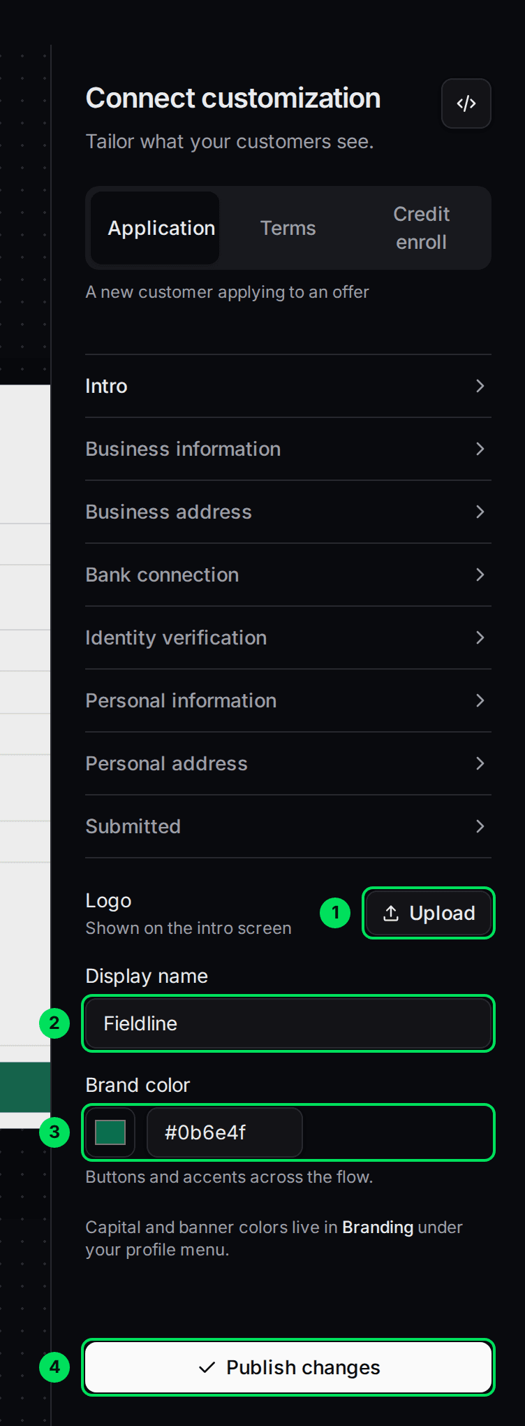
- Upload: your logo.
- Display name: your company name.
- Brand color: the colour for buttons and accents.
- Publish changes: saves all three.
What does publishing change?
- Customers see the new colours the next time a Slate screen loads. This includes screens already on your site. You don't change any code.
- Publishing colours on a Capital or Credit Line page saves the whole set at once, including brandColor.
- Publishing on Application Flow keeps your other colours as they are.
- Sandbox and Live are separate. Check your colours again after you switch to Live.
If something goes wrong
Publish theme is grey
You haven't changed anything yet. Change a colour first.
My change doesn't show for customers
A colour is only a preview until you select Publish theme or Publish changes.
A page says "Branding under your profile menu"
There is no Branding item in your profile menu. Use the colour settings on the product pages described above.
Learn more about how Slate goes into your product.
Still stuck? Email [email protected] with your account email and the screen you are on. We reply within 24 business hours.